A chocolate-brown handbag beside a brown sweatshirt can introduce more variety than an entirely different color would. The difference lies in the reddish tint of the bag, the softer appearance of the clothing, and the way those finishes interact. I find combinations like this especially interesting because the smallest decisions often give everyday clothing its personality. You can make an outfit feel distinctive without depending on an elaborate design or an obvious statement piece.
Minimalist outfits for women leave plenty of room for individual taste, including printed sweatshirts, textured jackets, decorative handbags, and unusual color pairings. What makes these combinations interesting is how the pieces respond to one another. A glossy finish changes the character of familiar denim, while a small patterned accessory can give pale clothing a completely different expression. I’ll explore these connections through practical styling observations you can adapt to the clothes and accessories you already enjoy wearing.
1. Chocolate Brown Dressing With a Subtle Burgundy Accent
Chocolate brown takes on several different expressions in this outfit. The oversized quilted jacket is noticeably darker than the muted brown sweatshirt and matching-looking pants underneath, while the handbag introduces a reddish burgundy tint. None of these pieces needs a bright accent to feel individual. Instead, the subtle changes between the colors give the combination a sense of richness that would be harder to achieve if every brown matched exactly.
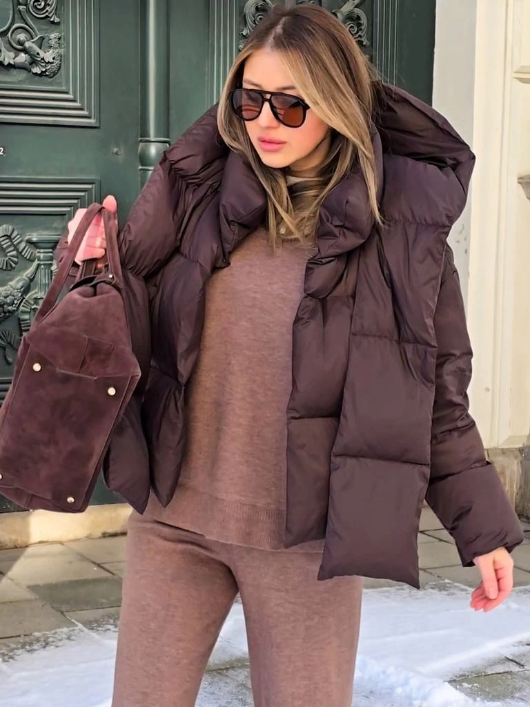
Photo via Instagram
The handbag is particularly effective because its compact, defined shape contrasts with the larger, softer clothing around it. Its dark finish gives it a stronger presence against the muted sweatshirt, while the quilted jacket brings a different kind of surface detail. Black sunglasses provide another small, distinct element without introducing an unrelated color. You can borrow this approach by combining familiar brown pieces with an accessory that has a noticeably deeper or warmer tint.
Try comparing shades of brown in natural light before deciding whether they belong together. A small difference in undertone can make coordinated casual clothing more expressive, particularly when the accessory also introduces a different shape or finish.
2. Charcoal and Black With Sharp Accessory Details
Black and charcoal might appear almost interchangeable at first, but this combination shows how different their visual character can be. The charcoal coat has a softer, more muted appearance than the black upper layer beneath it, and the dark gray jeans introduce another subtle variation. The coat’s relaxed, substantial sleeves add an informal quality, while the dark clothing underneath feels comparatively direct and uncomplicated. The result is a dark outfit with differences worth noticing.
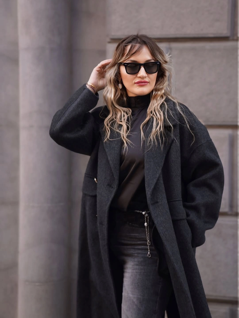
Photo via Instagram
What I particularly like here is the role of the small black accessories. The sunglasses have a defined outline, and the visible belt creates a concentrated dark detail against the jeans. These elements are much more compact than the coat, so they contribute a sharper finish to the overall combination. If you already wear plenty of dark clothing, experimenting with accessories that have cleaner, more definite shapes can be more interesting than introducing a contrasting color simply for variety.
Charcoal works beautifully as a companion to black because the colors remain closely related without becoming indistinguishable. Consider how a belt, pair of sunglasses, or similarly compact accessory can introduce a precise detail among garments with a softer appearance.
3. A Statement Graphic Hoodie With Everyday Blue Jeans
A large illustrated graphic gives this brown hoodie an identity that plain clothing would not have. The back features a prominent arrangement of light-colored lettering and intricate artwork with warm gold-toned details, creating a decorative surface against the deep brown background. Loose blue jeans provide a familiar partner, and their uncomplicated appearance makes the combination feel casual rather than overly coordinated. It is an excellent example of how minimalist styling can accommodate a garment with a strong visual personality.
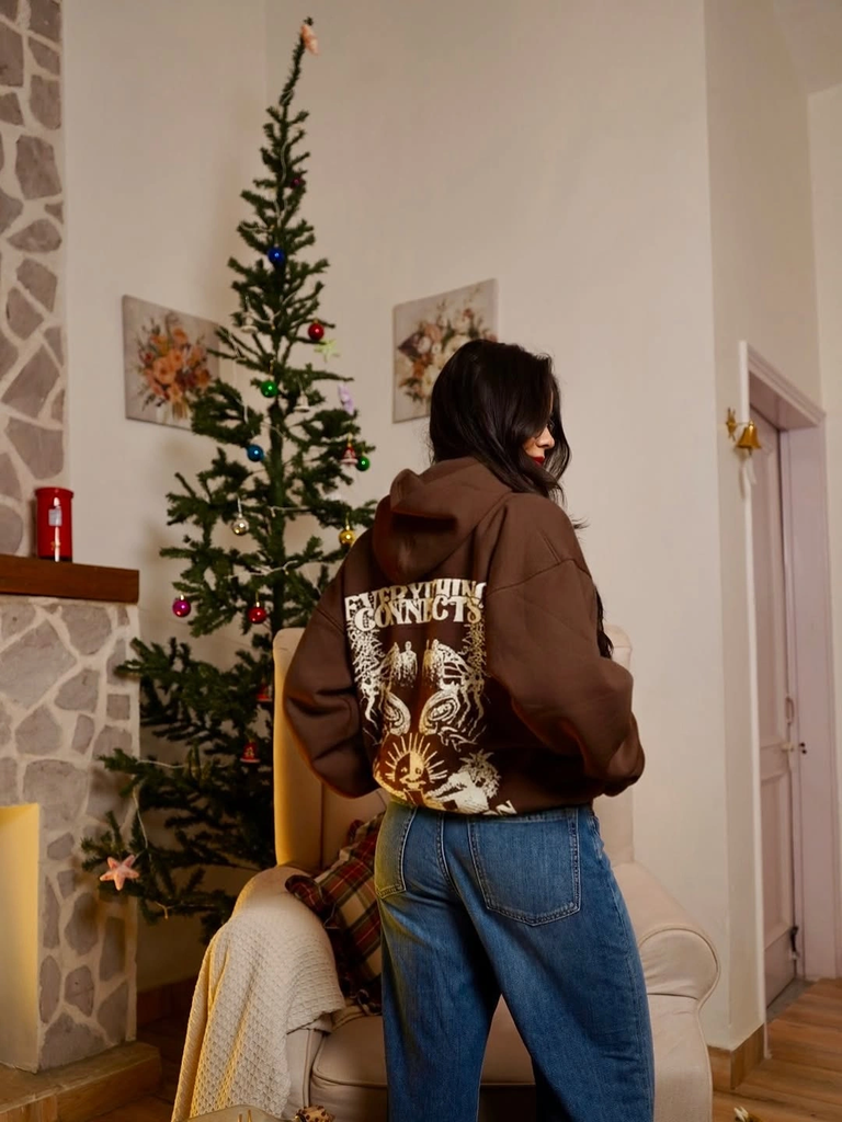
Photo via Instagram
Instead of repeating the artwork’s colors or introducing additional patterns, the visible outfit relies on the contrast between a decorated hoodie and straightforward denim. The brown and medium blue create a recognizable casual color pairing, while the graphic adds a more expressive element. This is useful when you own a sweatshirt or hoodie with artwork you genuinely like. You do not need to build an entire outfit around every shade in the illustration; familiar jeans can be a perfectly convincing choice.
A graphic garment can be the most distinctive part of an otherwise simple outfit without making the combination feel excessive. Look for supporting pieces that suit the overall character of the garment rather than trying to match every decorative detail individually.
4. Cream Clothing With a Small Patterned Handbag
The creamy white pieces in this outfit create a polished impression, but the small patterned handbag introduces an entirely different visual quality. A long light coat sits over a pale upper layer with fine linear detailing, accompanied by coordinating light trousers. The handbag’s compact shape and geometric-looking surface bring a more intricate element into the combination. Rather than changing the overall color character, the accessory gives the pale clothing an interesting decorative counterpart.
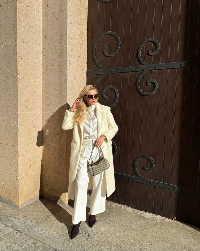
Photo via Instagram
Dark sunglasses and pointed footwear are useful contrasts here because their stronger outlines differ from the softness of the cream-colored clothing. The handbag sits between these two visual approaches: its light and dark pattern feels connected to the outfit, yet the smaller decorative shapes make it noticeably more detailed. If you enjoy wearing ivory, cream, or similarly pale colors, consider a handbag with a modest geometric pattern instead of automatically reaching for a plain one. The difference can be subtle but still meaningful.
A patterned accessory does not have to dominate an outfit to make a worthwhile contribution. When the surrounding garments have relatively quiet surfaces, even a small amount of geometric detail can introduce an appealing sense of variation.
5. Glossy Olive Green Meets Dark Denim and Black
The olive-green jacket immediately stands apart from the black clothing underneath because its surface catches the light. Its glossy appearance creates bright and dark variations across the sleeves and front panels, giving the relatively simple jacket a distinctive finish. The black top and dark wide-leg jeans appear much more subdued by comparison. I like how this combination demonstrates that a noticeable difference in surface quality can make a muted color feel unexpectedly expressive.
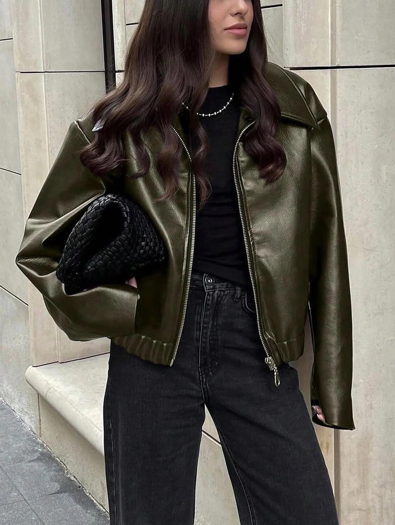
Photo via Instagram
A compact black textured clutch adds another finish to the outfit without introducing an additional prominent color. Its dark appearance relates closely to the jeans and upper layer, while its smaller shape contrasts with the broader jacket. The visible zipper and delicate necklace contribute a few restrained metallic details, but neither competes with the olive surface. For a similar combination, try pairing one slightly reflective piece with familiar matte-looking clothing and a compact accessory whose texture adds a quiet secondary detail.
Olive green does not need to be bright to have character, especially when its finish differs noticeably from the pieces around it. Combining a glossy-looking garment with dark denim and a small textured accessory is a useful way to make everyday clothing feel more deliberately chosen.
6. Deep Brown Sweater With Soft Cream Trousers
A deep chocolate-brown sweater and pale cream trousers make an appealing combination because the two colors have very different levels of intensity. The dark upper garment looks substantial against the lighter, more open appearance of the trousers, while the absence of visible print allows their colors to speak for themselves. There is something refreshingly uncomplicated about this pairing, especially when the individual pieces have such relaxed shapes.
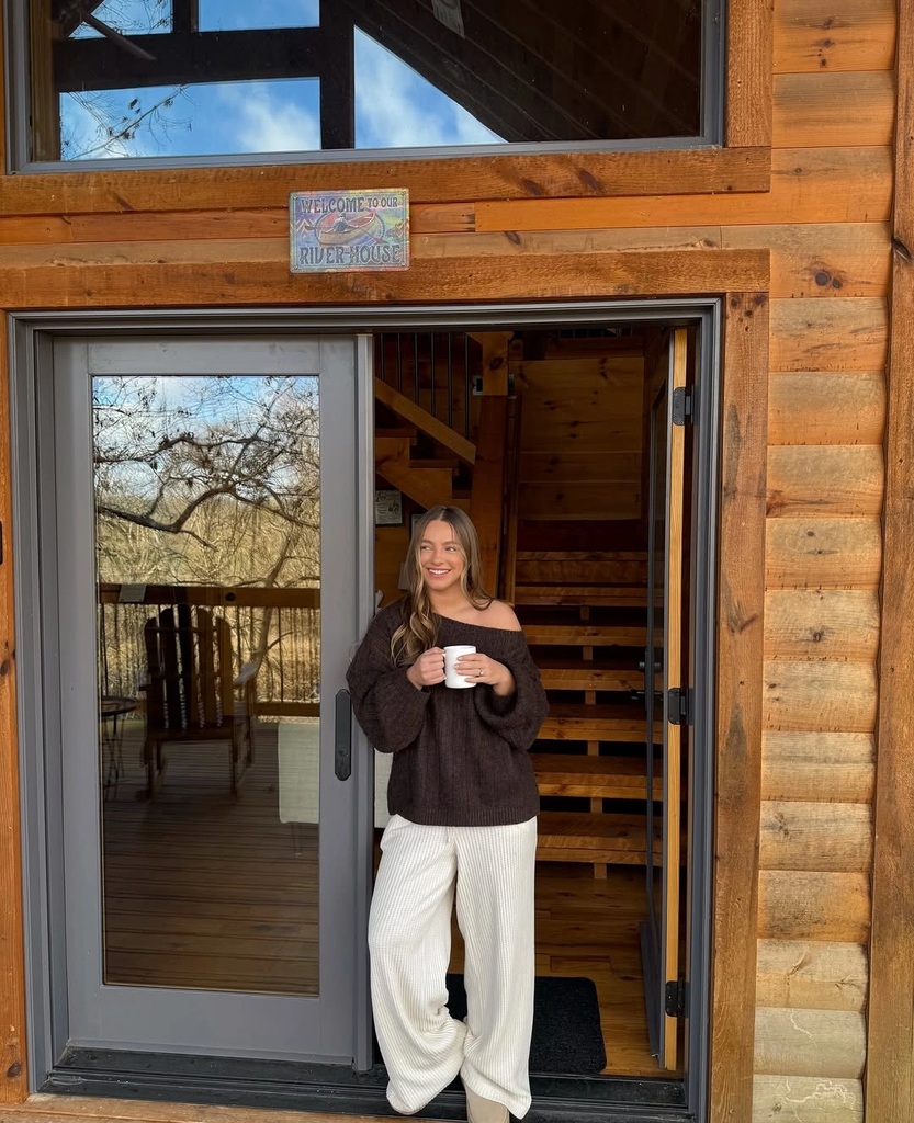
Photo via Instagram
The sweater has a loose, softly rounded appearance, while the cream trousers fall in broad, easy folds toward the light-colored footwear. Neither garment has conspicuous decorative details, so their contrasting colors provide much of the outfit’s character. If you want to recreate this effect, choose a rich brown top and cream bottoms that feel visually distinct without needing an extra accent color. The combination is interesting precisely because it allows familiar clothing to feel complete without elaborate styling.
Dark brown can be a beautiful alternative to black when you want a strong contrast with cream or ivory. Look at how the colors relate before adding accessories, since a well-chosen pairing may already offer all the variation you want.
7. Pink Textured Coordinates With Delicate White Accessories
Pale pink takes on a more expressive character when it appears across a visibly textured jacket and matching wide trousers. The surface has a delicate pink-and-white pattern that gives the coordinated outfit a decorative quality without relying on a separate printed garment. A light high-neck top sits beneath the jacket, creating a gentle continuation of the pale colors. I especially like how the texture makes the ensemble distinctive even though the overall color impression remains soft.
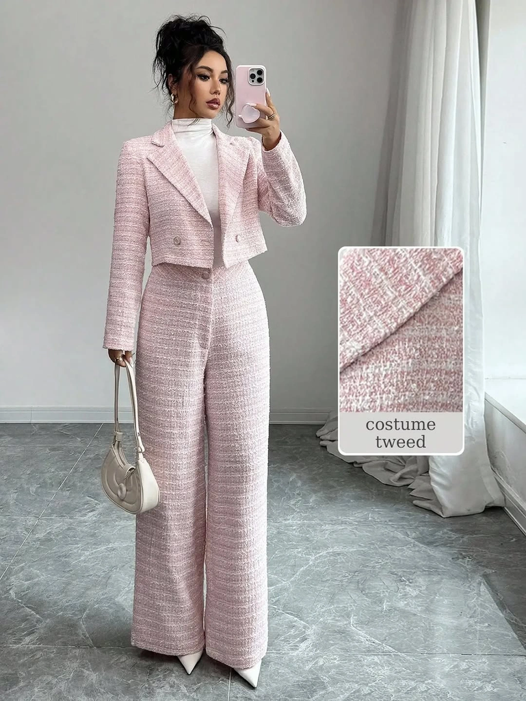
Photo via Instagram
The small light-colored handbag offers a different visual treatment from the textured clothing, with a compact shape that feels comparatively simple. Its pale color works naturally with the white details in the jacket and trousers, rather than bringing an unrelated accent into the outfit. This is a useful approach when wearing coordinated pieces with visible texture: consider accessories that relate to one of the existing colors but have a quieter surface. You can preserve the character of the fabric while still giving the outfit a finished appearance.
Textured coordinates can feel expressive without additional decorative accessories, particularly when the fabric already contains subtle variations in color. A compact, relatively plain handbag is a thoughtful companion because it introduces another shape without demanding equal visual emphasis.
8. Silver Patterned Boots Bring Personality to Black Tailoring
The unexpected element in this black outfit is the pair of silver-toned patterned boots, which introduce a bright, decorative surface beneath much darker clothing. A structured-looking black blazer, dark upper layer, and long flowing lower garment create an understated combination with relatively few visible embellishments. Against those pieces, the footwear feels distinctive without requiring the rest of the outfit to become equally expressive.
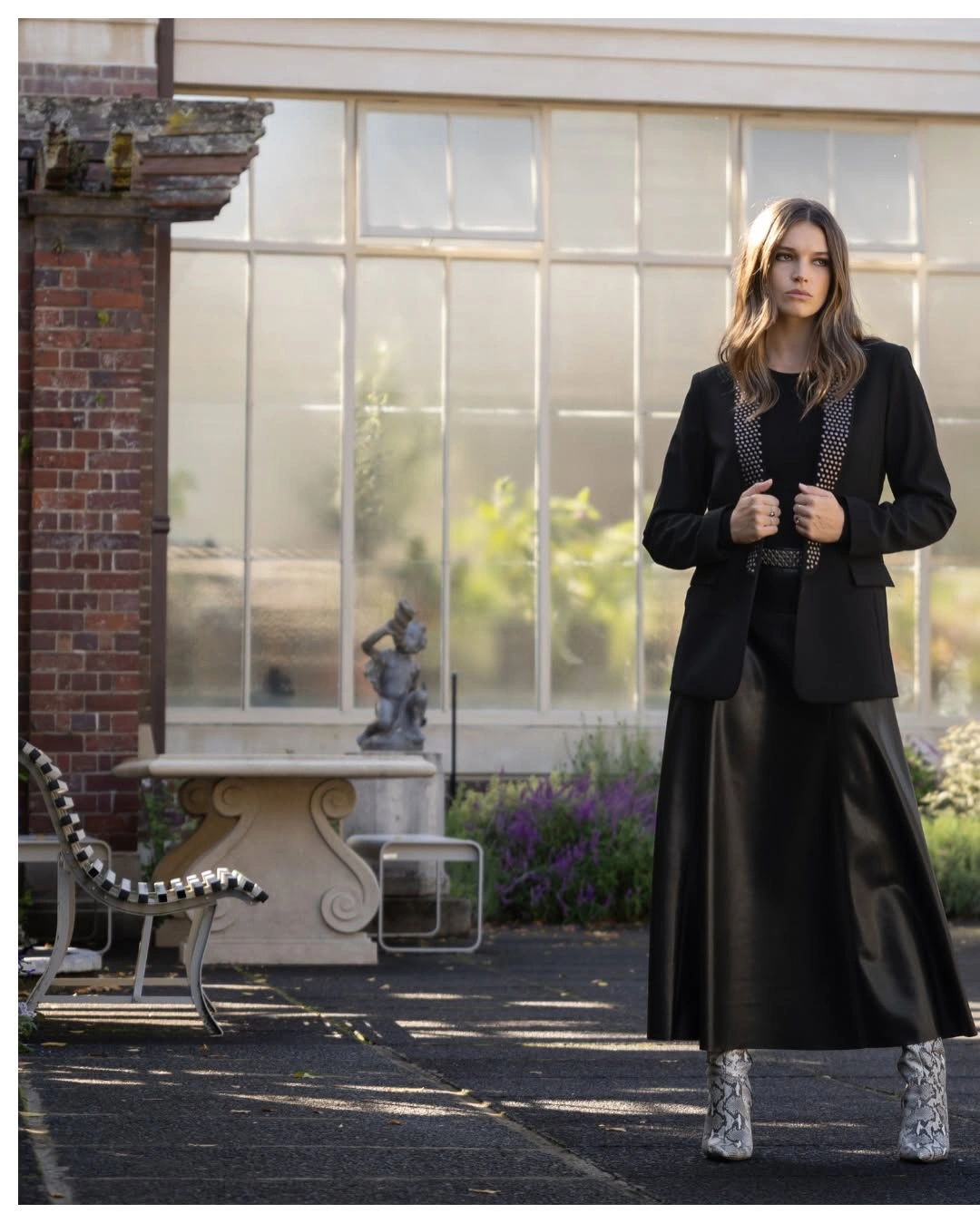
Photo via Instagram
The boots have a dense silver-gray pattern that differs noticeably from the comparatively smooth-looking dark clothing, creating an interesting relationship between ornament and restraint. Their reflective appearance also gives the outfit a different character from one finished with ordinary black footwear. If you enjoy interesting shoes but prefer uncomplicated clothing, this is a useful idea to explore. You can choose one decorative pair and combine it with familiar tailored-looking pieces instead of repeating the footwear’s pattern elsewhere.
An expressive shoe can change the personality of an outfit even when the clothing itself remains very simple. Metallic-looking finishes and intricate patterns are especially interesting beside dark, relatively plain garments because their surface details remain easy to appreciate.
9. Gray Graphic Hoodie Paired With Pale Yellow Pants
Pale yellow trousers give this casual combination a different character from the more familiar pairing of a gray hoodie with blue denim. The sweatshirt has a loose silhouette and a collection of colored graphics and lettering across the front, while the trousers introduce a soft, buttery shade beneath it. A light knitted hat complements the gray upper garment without copying its printed details. The result feels playful but still straightforward in its overall color choices.
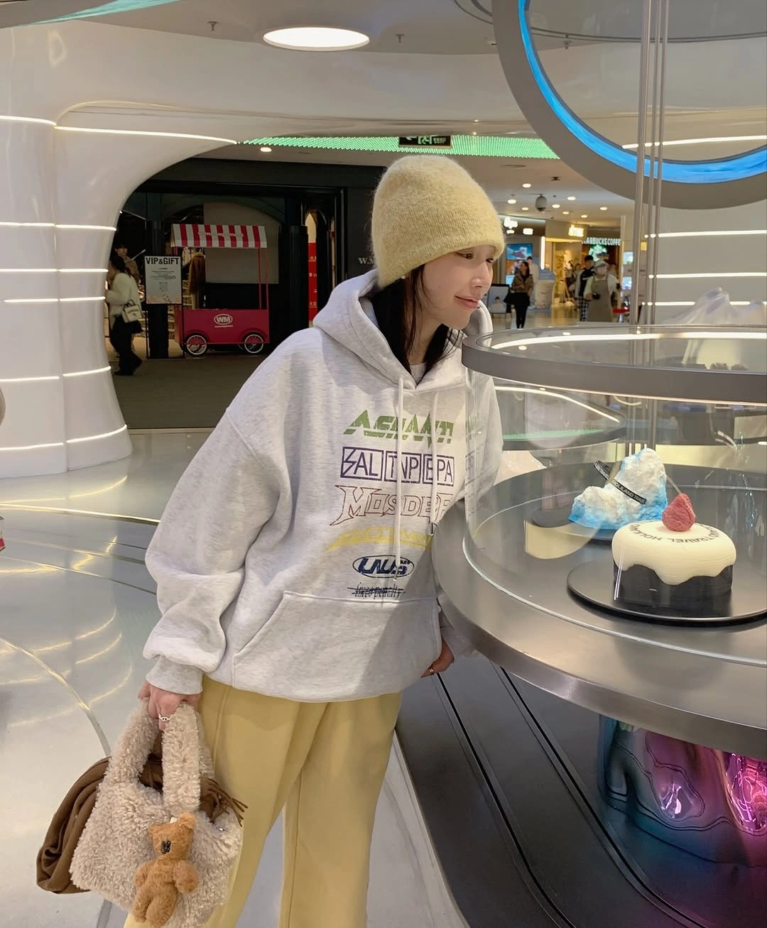
Photo via Instagram
What makes the pairing work is that the pale yellow is noticeable without appearing especially intense beside the light gray sweatshirt. The printed artwork adds several small color details, but the trousers do not need to reproduce them exactly to feel connected to the outfit. A soft-looking tan-brown item is carried in one hand, bringing another muted tone into the visible combination. For your own outfits, consider replacing ordinary neutral bottoms with a gentle color that suits the relaxed character of a graphic top.
Graphic sweatshirts can pair beautifully with colored trousers when the colors have a similarly subdued quality. Rather than matching every element of the print, try choosing a lower garment that introduces its own understated shade and gives the combination a little more individuality.
10. An Ornamental Sweater With Relaxed Light Blue Jeans
The dark sweater has a particularly recognizable decorative character, with repeated cream and warm brown motifs arranged across its surface. Those intricate shapes create a busy, rhythmic pattern, while the light blue jeans introduce a much plainer visual element. The denim feels familiar beside the ornamental sweater, making the combination accessible rather than overly coordinated. Black lace-up boots add a solid dark detail beneath the pale jeans.
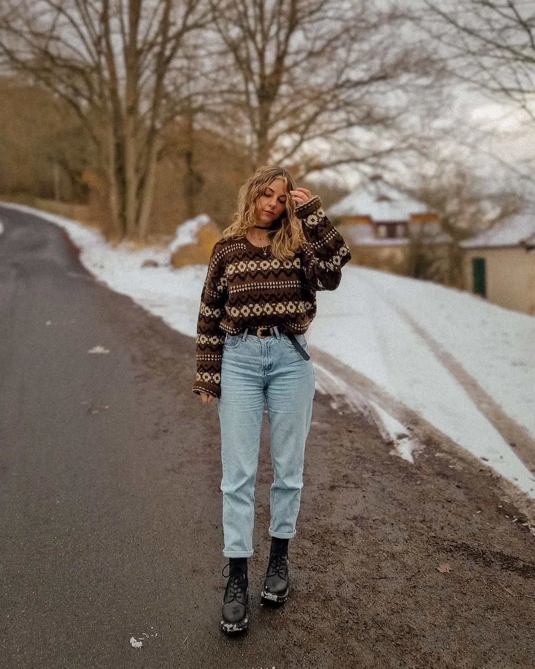
Photo via Instagram
Repetition is what gives the sweater its distinctive appearance, with similar motifs appearing across multiple areas rather than one isolated graphic. The blue denim provides a different color and surface, avoiding any attempt to imitate the ornamentation above it. I like how the black boots relate to the sweater’s dark background while maintaining a simpler appearance of their own. You can adapt this combination with a patterned top you already own, letting straightforward jeans and dark footwear serve as natural companions.
Decorative knitwear does not require complicated styling to look considered, especially when its pattern already contains several colors and repeated shapes. Pairing it with familiar denim and solid dark boots allows the garment’s personality to remain intact without introducing additional competing decoration.
11. Chocolate Brown and Dusty Plum Make an Unexpected Pair
The muted plum skirt brings an unusual color into an otherwise familiar combination of dark brown knitwear and black accessories. Its subdued purple tone has a different character from the chocolate-colored sweater, yet the two shades share enough depth to feel naturally connected. This is the kind of pairing I enjoy exploring when conventional neutrals start to feel predictable. Neither color is especially bright, but together they create a distinctive impression that a simple brown-and-black outfit might not achieve.
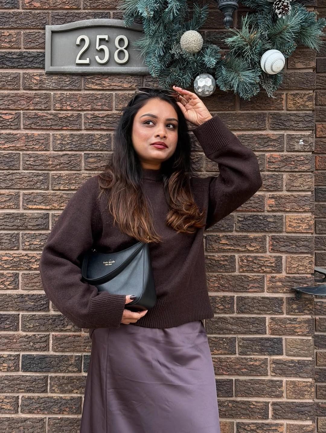
Photo via Instagram
The sweater has a loose, soft-looking shape, while the visible skirt appears smoother and falls into gentle folds beneath it. A compact black shoulder bag introduces a more defined accessory, with its curved outline and dark surface differing from the clothing around it. The bag does not attempt to match the plum or brown exactly, which makes the combination feel relaxed rather than overly coordinated. You could try a similar approach with muted purple, mauve, or dusty plum pieces alongside chocolate-colored knitwear and a small black accessory.
Brown and purple are worth experimenting with because their relationship can feel subtle even when the colors are noticeably different. Choose softened versions of each shade and let their natural contrast give the outfit personality without adding an elaborate print or decorative finish.
12. A Textured Black Jacket With a Petite Structured Handbag
This black outfit has a dramatic surface quality that comes almost entirely from the voluminous, fluffy-looking jacket. Its dense texture creates irregular highlights and shadows across the sleeves and front, while the fitted-looking black upper layer beneath it has a much quieter appearance. The dark lower clothing continues that understated impression, allowing the jacket to feel particularly expressive. It is a good reminder that black garments can look completely different from one another even when their colors appear closely matched.
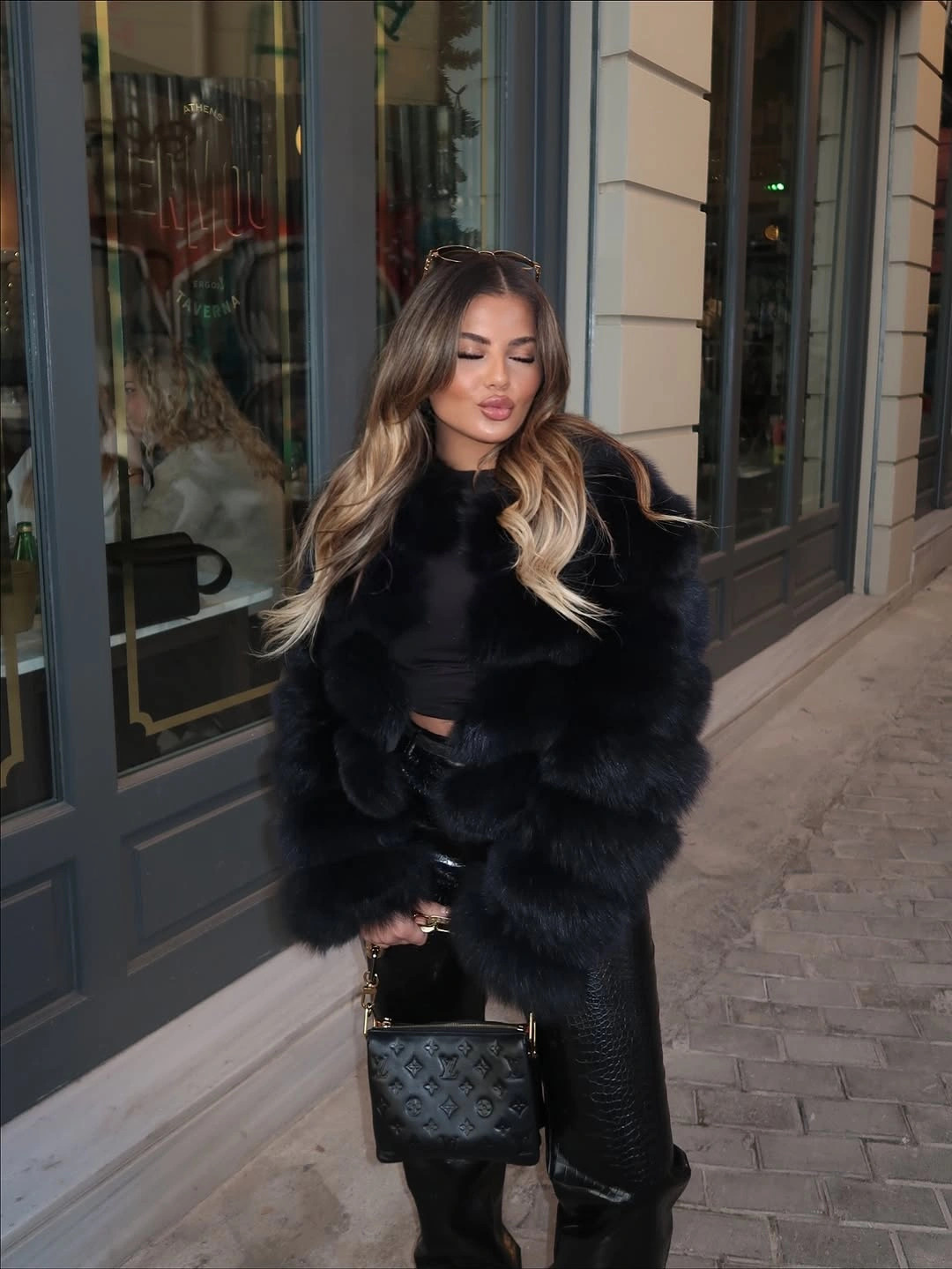
Photo via Instagram
The small structured handbag introduces an entirely different type of detail through its defined handles, compact body, and decorative dark surface. Beside the substantial jacket, the bag looks particularly petite, making their contrasting scales an important part of the combination. I like that its ornamentation offers something to notice without attempting to reproduce the jacket’s fluffy texture. When you wear a noticeably textured piece, a small bag with a clear shape can provide an interesting alternative to carrying another equally voluminous accessory.
Strong texture can make an all-black outfit expressive without requiring contrasting colors. Try combining one substantial, soft-looking garment with a compact accessory that has a more defined shape, and notice how each contributes a different kind of detail.
13. An Oversized Tan Handbag With Cream and Black
The oversized tan handbag is easily one of the most distinctive elements in this combination, thanks to its generous size, warm color, and scattered stud-like embellishments. A creamy white sweater and matching-looking light hat bring a much softer appearance to the upper half, while short dark bottoms and tall black boots introduce a stronger, more defined contrast. The bag adds something different from both groups, making the overall outfit feel more personal than a straightforward cream-and-black pairing.
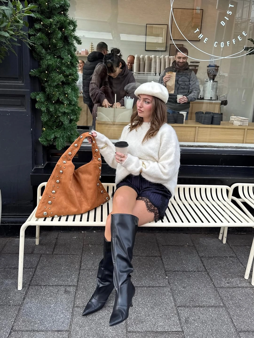
Photo via Instagram
What interests me here is the way the bag functions almost like another major garment rather than a small finishing detail. Its broad tan surface creates a substantial block of warm color, while the metallic-looking decorations add small points of visual interest. The black boots are comparatively sleek and uninterrupted, providing a different surface from the embellished accessory. If you enjoy larger handbags, consider allowing one to contribute a significant part of an outfit’s color and character instead of treating it as something that must disappear into the clothing.
An oversized bag can introduce personality through its shape, color, and decoration all at once. When choosing one with visible embellishments, try pairing it with relatively straightforward clothing so the accessory retains its individual character without needing matching decorative pieces.
14. Sporty Red Lettering Against Dark Polished Outerwear
A white top with bold red script-style lettering introduces an informal, graphic element beneath a long dark outer garment with a smooth, slightly reflective appearance. The combination feels interesting because the lettering has a casual character that differs noticeably from the more polished-looking exterior. Dark blue jeans and black pointed boots contribute their own familiar elements without copying the red graphic. I especially like how the printed top gives this otherwise dark ensemble a playful note.
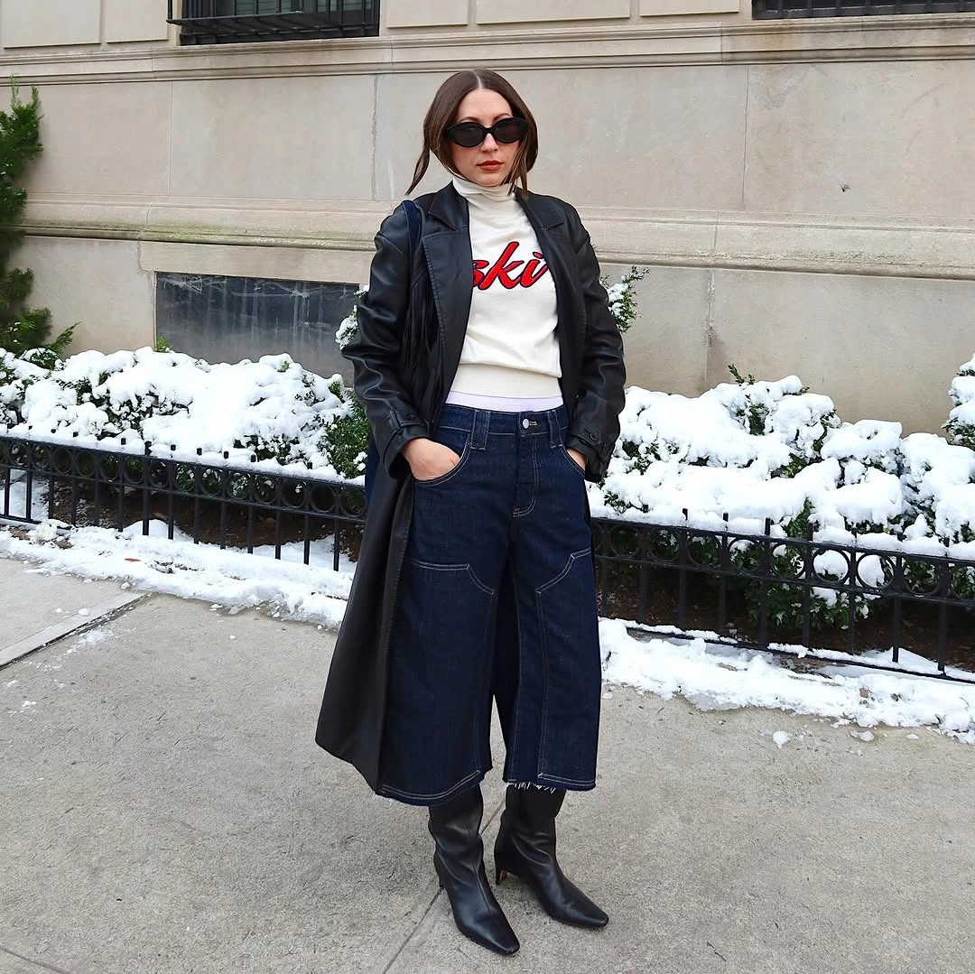
Photo via Instagram
There is a deliberate contrast between the casual appearance of the white graphic top and the sharper details of the pointed boots and dark sunglasses. The jeans also feature visible pocket detailing, adding a quieter decorative element that does not compete directly with the red lettering. Rather than trying to make every piece belong to one formal or casual category, the outfit combines different visual attitudes. You can borrow this idea by wearing a graphic top you enjoy with smoother, more tailored-looking pieces and letting the contrast become part of the appeal.
Graphic lettering can introduce a distinct personality into an outfit built around familiar dark clothing. Choose accessories with straightforward shapes when you want the printed element to provide the main playful detail, rather than adding several unrelated graphics.
15. Muted Camel and Black With a Burgundy Handbag
The muted camel-brown coat creates a warm, earthy presence against the dark clothing visible underneath, but the small reddish-brown handbag introduces a particularly interesting variation. Its burgundy-leaning tone is related to the warmth of the coat without being an exact match. From a distance, the overall combination appears understated, and the bag provides a small but meaningful departure from the surrounding colors. This is a lovely example of how a quiet accessory choice can make familiar neutral clothing feel more individual.
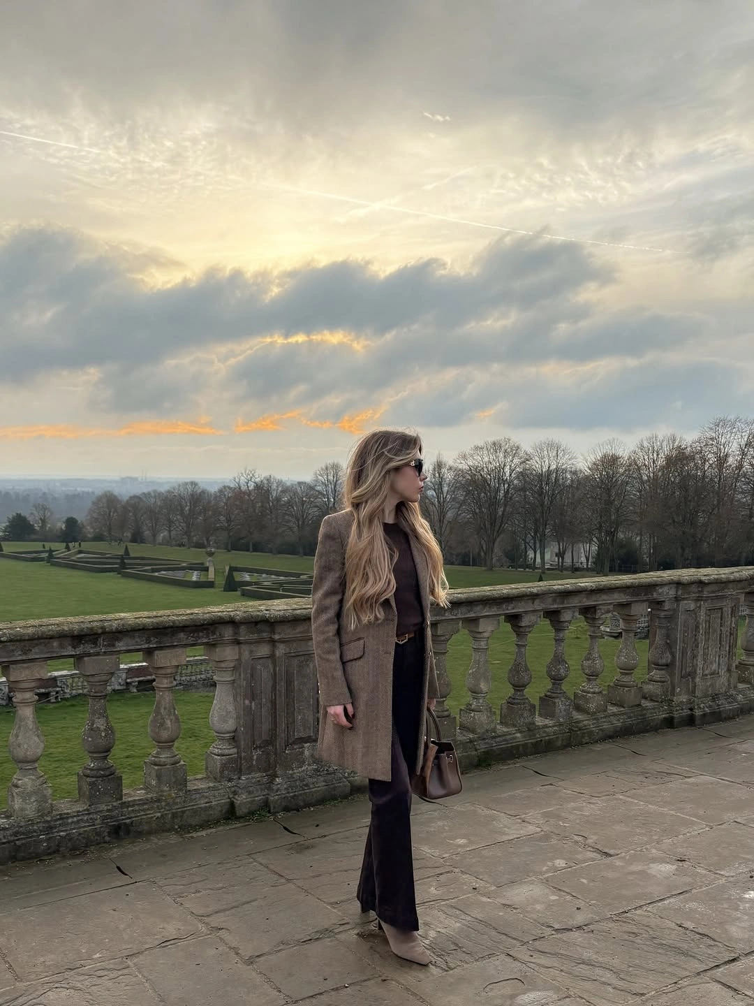
Photo via Instagram
The coat has a relatively straightforward appearance, with its broad muted surface providing a contrast to the darker, narrower-looking clothing beneath it. The small handbag introduces a more concentrated color detail, while the dark trousers and visible footwear maintain a consistent lower palette. Because the photograph is taken from a distance, the relationship between these larger areas of color is more apparent than any fine textile detail. You could recreate a similar effect with a camel or taupe outer garment, black clothing, and one compact accessory in a deeper reddish-brown shade.
Burgundy and muted camel can make an appealing combination because both colors contain a sense of warmth without looking identical. A small handbag is an approachable way to experiment with that relationship, especially when the rest of your clothing already feels complete.
Leave a Reply